Client Spotlight: Fat Loss DFW

We happened to connect with a team member from Fat Loss DFW at the Arlington Chamber of Commerce last year, right when they were in search of a graphic designer. The nutrition arm of their parent company, Elevation Health, had been operating as an affiliate of a larger nutrition brand/program and they were wanting to break away and develop their own branding as Fat Loss DFW. Beginning to market themselves as an independent local business with many nutrition and wellness service offerings has helped them to grow and develop as a company.

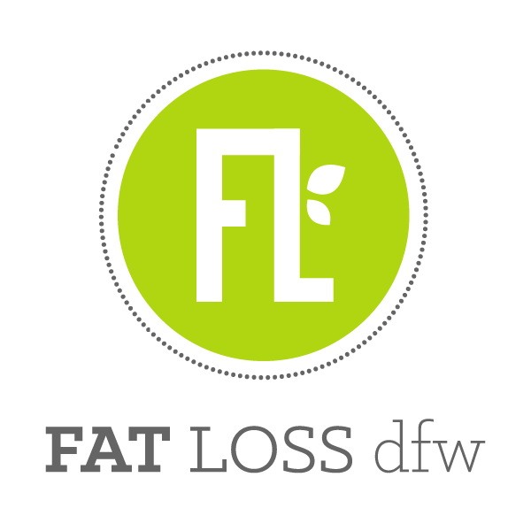
They wanted their logo to coordinate with their existing Elevation Health branding by using a similar color palette, but not matching the logos too closely of course. We tried a few different initial options, many of which attempted to represent "fat loss" graphically, but in the end, the client decided to focus more on a fresh look emphasizing the nutritional aspect of their program rather than a scale, or similar weight-loss-related graphics.

In the time since we created their new logo, they have been able to update their branding, website, business cards, and social media themselves, but we have been able to work with them on additional projects, creating new event/show signage in the form of flyers, handouts, brochures, and even retractable banners. 

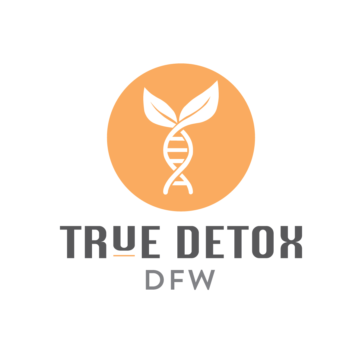
One of the owners of Fat Loss DFW has been developing another brand in recent months as well – True Detox DFW, which is a cellular detoxification program. They really have every aspect of wellness covered between these three businesses! We created a logo to help launch True Detox DFW and in developing that look, we again wanted to stay cohesive between the three brands, but without being too "matchy." The True Detox logo definitely looks like a sister-company of Fat Loss DFW and we especially love beautiful breakout orange color! We're so proud of the work we've done for these businesses and we are excited to watch them continue to grow.

Web Design Upgrade

We've got a fresh new look!

While the clean, minimalist aesthetic of our website has served us well in the past, we wanted our online presence to pack a little more punch and be more reflective of the caliber of work we produce for our clients.

Additionally, we have showcased a LOT of our design work online in the past and it's been on our to-do list to refine our online portfolio. We are still showing a broad range of our work, so viewers can see what we can do and have done without feeling bombarded with never-ending thumbnails.

Take a look around and let us know what you think of our fresh design

And better yet, who do you know in need of a website upgrade? Send them our way or reach out here!

Logo Design: Color Psychology, Fonts & Unbreakable Rules

I designed my first logo back in journalism school in 2001 if you can believe it. More than 15 years and hundreds of concepts later, I have more than a few logo design tips to share!

Color Rules
for Logo Design

Color communicates SO much information to us about a business, whether or not we realize it. For this reason, we will typically send the first round of logo proofs in black and white so clients can focus on the design itself instead of being drawn to a design because of its color.

Color can bring up deeply rooted emotions, as specific colors are associated with certain ideas (which you may or may not want associated with your brand). Take some time to look at our psychology of color graphic – do you agree with the traits these colors represent? If we were developing a logo for a new salon/spa business, would we want to create a big, bold logo in red? Maybe, but probably not, yet I see them everywhere! What about a multi-color or pink logo for a bank? Maybe not...

A few more interesting tidbits on color:

  • Red can actually raise your heart rate, blood pressure, and body temperature, and even make you feel hungry (it’s no secret many fast food and restaurant logos are red)!

  • Yellow may come off as too weak or as cautious; it's also typically too bright to stand on its own and will usually require an accent color as a background or border.

  • Blue is the most common logo color and is generally affiliated with large corporations. Most financial institutions use blue in their branding (because it conveys honesty, trust and integrity, of course).

  • Purple can be polarizing and may come off childish if used incorrectly (though since it appeals to children, you'll notice it often used in toy and candy package design).

  • Black, like brown, can be seen as boring. Keep the fonts crisp and fresh to avoid this.

Above all, when planning to brand your business, please don’t choose a color just because it's your favorite color (or worse, your child's favorite color... unless the business is a children's boutique)! Give some serious thought to the core values of your company and determine what color(s) best represent those values. One final (usually-unbreakable) rule: try not to incorporate too many colors in your logo. Instead of multiple colors, try monochromatic shades (using varying tones of only one color).

Number One Font Rule for Logo Design

There are plenty of do's and don'ts for pairing complementary fonts, but if there is one cardinal rule, it's to not use too many (1-2 fonts is best, but no more than 3 as a hard rule). Mixing a sans-serif font with a serif font is always nice, or mixing a script font with serif. It's also great to use varied weights of the same font family (for large font families like Helvetica, Garamond, Futura, Myriad, Minion, etc.) Typically, serif fonts evoke tradition, respect, and integrity (ex. Garamond, Times), whereas sans-serif fonts feel modern, high-tech, clean, and simple (ex. Futura, Helvetica, Arial).

Some final thoughts to keep in mind when imagining your logo

  • Your logo isn’t for you, it’s for your customer.

  • When comparing concepts, think about how the logo makes you feel. Do those feelings correspond with the business’ core values?

  • Is there a meaningful story behind the logo?

  • Will the logo stand the test of time or is it trendy (is your business meant to be trendy or are you trying to build clients for life)?

  • Is the logo unique and easily recognizable in a sea of competitors?

  • Does the logo still look great in black and white?

  • Does the logo scale nicely (does look good both super-small and huge)? If not, it might not be a deal-breaker, but you might need a brand mark. We can help!